Note, this post more or less follows this post by Charles Leifer, except in less detail, and explained more poorly.
One of the top posts on the unixporn subreddit (SFW, really.) is this post that shows how a redditor generates color themes for his window manager from images using a script. He gets the code from Charles Leifer, who explains how the script works. Basically, the script detects the dominant colors in the image using k-means clustering.
As an exercise, I tried recreating the script in R. I didn’t exactly look at Charles’ code, but I knew the basic premise was that it uses k-means to generate a color palette.
I liked the idea of using R over Python because (a) as a statistics major I use R all the time and (b) there’s no other reason, R’s just fairly nice to work with.
Color spaces
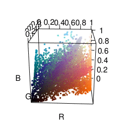
k-means performs differently depending on how you represent colors. A common color space to use is RGB, which represents colors by their red, green, and blue components. I found that representing colors in this manner tended to result in points along the diagonal. This happens since images usually have many shades of the same color, so, if you have $(r, g, b)$ you also tend to have $(r+10, g+10, b+10)$. This results in clusters having a sort of elongated shape, which isn’t that great for k-means since it seems better at picking out more “round” clusters. There is often a lot of correlation between dimensions. Maybe I’m not making a lot of sense here, suffice to say I wasn’t terribly pleased with the clusters I was getting.
The next color space I tried was HSV, which represents colors in terms of hue, saturation, and value. This actually got me some fairly satisfactory clusters. As you can see in the graphic below, it’s much easier to separate different colors. The only problem was that it made me want to put more weight on the “hue” dimension than the “saturation” or “value” dimensions. Many clusters ended up just being gray.
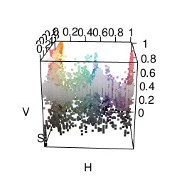
One cool thing is that R already does HSV fairly easily using the rgb2hsv function.
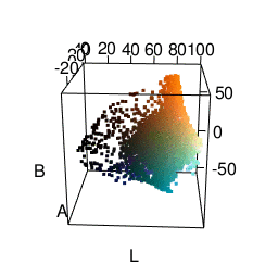
I was most satisfied using LAB space. This represents colors with one “lightness” dimension and two color dimensions “A” and “B”. It was made to approximate human vision, and as you can see from the graphic below, distances between colors seem more meaningful. In fact, using Lab space is a recommended way of finding color difference. A good package for using this in R is the colorspace package.
k-means
Another nice thing about R is that it has its own kmeans function built in. I actually tried writing my own, which looks like this:
## Do k-Means
## It tends to lose some k values
kMeans <- function(k, X, iter = 5) {
    ## Assign random membership
    membership <<- sample(1:k, size=nrow(X), replace=TRUE)

    for(i in 1:iter) {
    mus <<- tapply(1:nrow(X), membership, function(x) colMeans(X[x,,drop=FALSE]), simplify=FALSE)
    dd <<- do.call(cbind, lapply(mus, function(mu) rowSums((matrix(mu, byrow=TRUE,nrow=nrow(X), ncol=length(mu)) - X)^2)))
    newmembership <<- apply(dd, 1, which.min)
    if(all(newmembership == membership))
        break
    membership <<- newmembership
    }
    list(mus = mus, membership = membership)
}
Unfortunately it’s liable to return fewer clusters than requested. I think what’s going on is that in some iterations no points are closest to a specific cluster, so it’s lost. Perhaps there’s a bug somewhere I need to fix. Anyway, I ended up using the kmeans function instead.
It may be interesting to use other clustering techniques. I use k-means here only because it’s relatively easy to use. However, I would like to try distribution-based clustering at some point.
From clusters to palette
Going from a list of colors to a palette configuration also requires some special thought. Given a list of colors like below, how do we pick which ones become a foreground color, background color, etc?
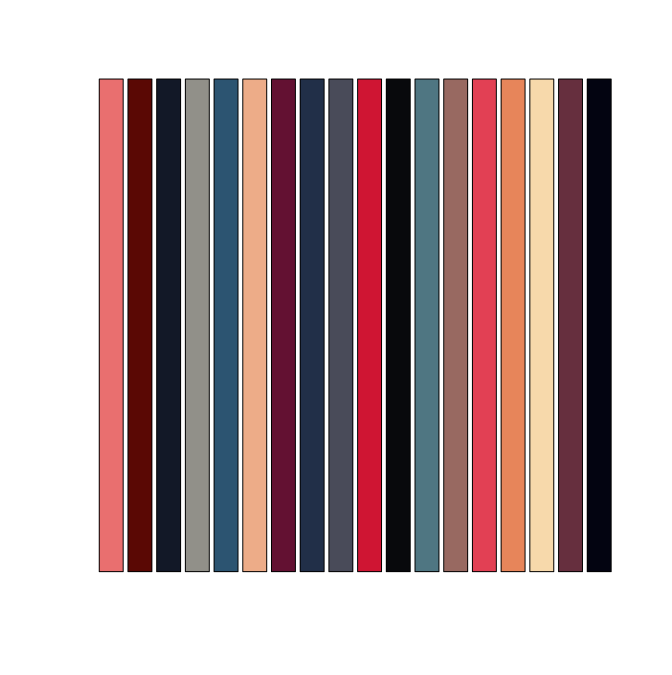
We’d like our foreground and background colors in xterm to be chosen so they have a lot of contrast. This is where Lab space is very convenient: color difference is calculated just using Euclidean distance. We can then use the dist function in R to directly create a distance matrix from our color clusters represented in LAB form.
The way I ended up generating a palette was doing the following:
- For the background color, take the first cluster (which is most represented color in the image). Then find the most different color for the foreground color.
- With remaining colors, find pairs of colors that are very similar. The first in the pair gets set as something like
color0 while the second gets set to color8.
Doing this, we end up getting a fairly nice palette from an image.
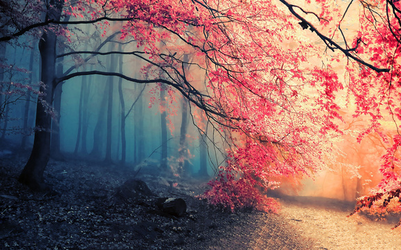
Here’s an example image used:
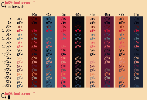
And how it ends up looking in xterm:
The actual code
Here’s all the actual code I used. It’s an Rscript that takes in a JPEG file as an argument and creates and xterm palette.
 Josh Moller-Mara