Recently I had to make a scientific poster for the Berkeley neuroscience retreat. I had asked my lab mates what they used to create posters. Most of them, I think, used PowerPoint, which I can't use since I'm on Linux. Using LibreOffice Impress also seemed like a pain. And I really wanted my poster to be in PDF format.
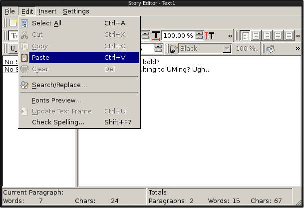
So I stumbled upon using Scribus, which is used for desktop publishing. Scribus can create print-ready PDFs and has facilities for wrapping text around images. I used it for about a week until I finally gave up. It turns out that Scribus is a real PITA to use. Laying out text with the story editor is irritating to say the least. For example, if you try to emphasize text like this in the story editor, you can't see it within the story editor. On top of that, you have to select all the text you want to change, like if I wanted to change from Arphic Uming to Courier or whatever, I have to select everything. But because the font's not automatically previewed within the story editor, you don't realize that you've changed absolutely nothing by using the drop-down menu. There's also no undo history as far as I can tell, which is probably why it's recommended to edit your text in a .txt file first.

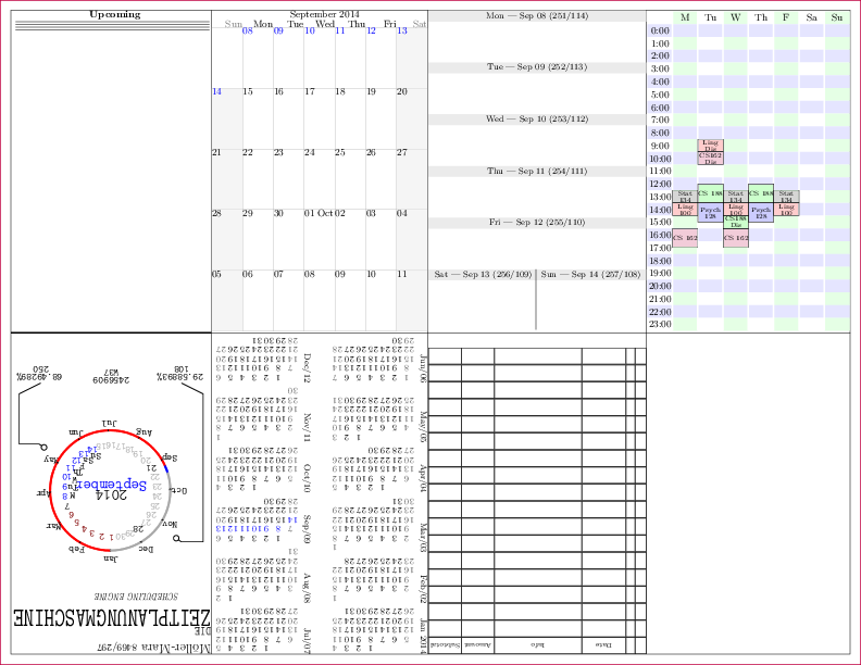
I think I got to finishing the layout before quitting on Scribus. I started looking for some LaTeX ways to edit my poster. I had used PGF/TiKZ to layout my hipster PDA "Zeitplanungmaschine" (see below) way back in 2009, so I knew arbitrary graphics layout was possible in LaTeX.

I found two good ways of laying out posters in TiKZ: tikzposter (formerly fancytikzposter) and baposter. I settled on using baposter, and now I don't remember why. I think the examples in baposter felt simpler, but don't quote me on that.
Baposter seems to essentially be a wrapper around TiKZ, making layout very quick. Positioning of boxes can be done relative to other boxes, which is great because I had real trouble with that in Scribus.
Here's an example of some LaTeX code for baposter:
|
|
I just have to put "below=introduction" in the second headerbox to place it underneath. It'll automatically be resized if the introduction changes size. I never really figured out how to do that in Scribus...
There are a lot of benefits of using LaTeX to layout posters. It's
very easy to comment out text, plus you can use your favorite text
editor (*cough* Emacs *cough*) to do all your editing. Changing
styles is fairly easy, and usually just involves redefining a
macro. Changes can easily be tracked with something like git as
well. Here's what my finished poster looked like:

Not bad.
 Josh Moller-Mara